

Quantum Design System
Unifying the look and feel of EA’s web presence, PC app, and subscription services—bringing the corporate brand along in the process.
My role: UX Director primarily responsible for the success of the PC App and EA Play subscription products; also led design for marketing web and identity & commerce services
An Understandable Mess
EA was founded in 1982, and has published hundreds of games in an often-shifting organization of studios. Each game and studio had its own visual identity, and the corporate identity was either an afterthought or a supporting role.
In the 2000s, when EA began creating their own marketing sites and direct-to-consumer products and services, this lack of identity persisted until it became unmanageable.
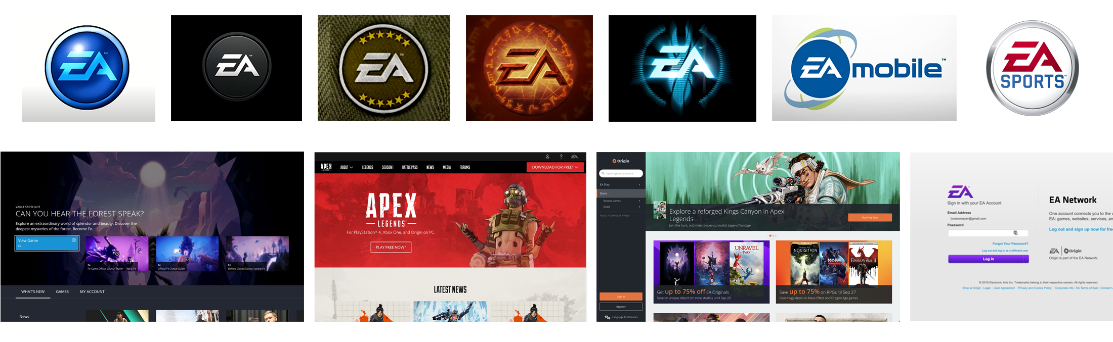
Now that’s how you ship an org chart!
Third-Party Subscriptions
Marketing Web
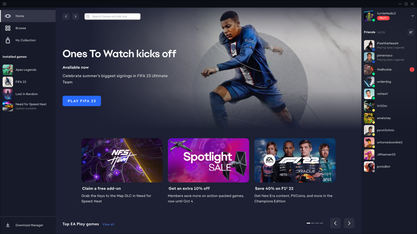
PC App
Services
Finding Inspiration
The tone of the system needed to appeal to our more hardcore players while also feeling accessible and contemporary.
The team found inspiration by looking outside of existing gaming zeitgeist, which tended to be overly stylized and contain heavy visual treatments that would be difficult to scale over many surfaces.
We wanted to develop a more functional aesthetic that still appealed to gamers' preferences while establishing an identity that could be recognized across platforms.
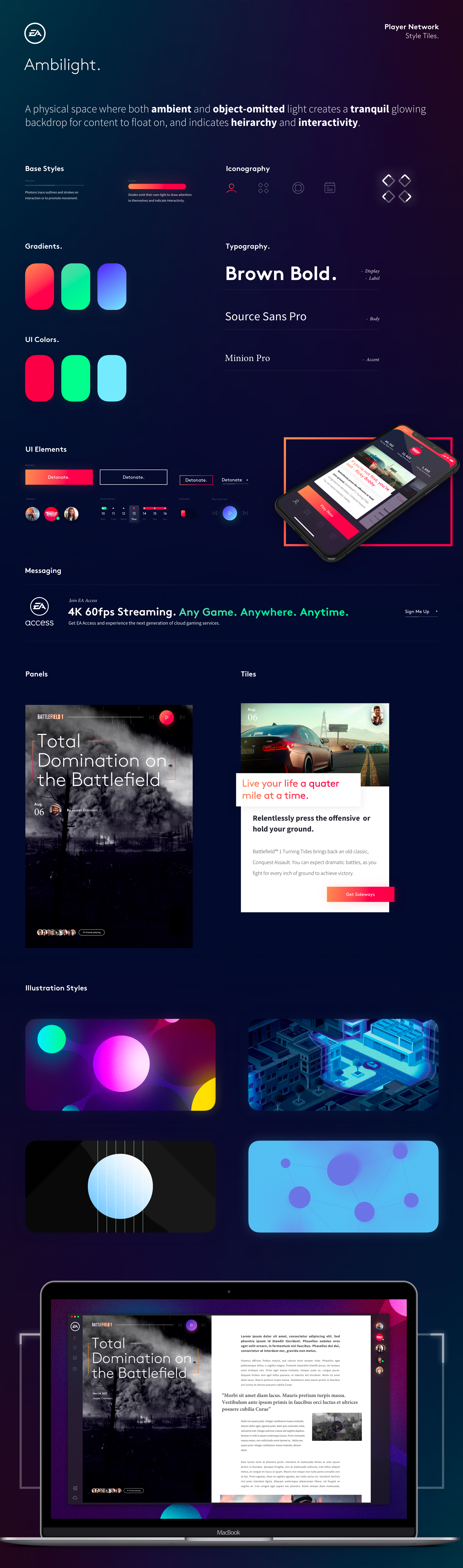
The initial style tiles.
Taking the explorations a step further, we began looking at how these tones could apply to various foundational design elements. This allowed us to define and battle-test a few rules of the system while helping leadership get into the vibe.
Every metamorphosis needs a metaphor!
A visual language derived from the elements of particle physics.

Photons
All colors, strokes, and transitions were based on the behaviors of how light moves through space.

Fields
All colors, strokes, and transitions were based on the behaviors of how light moves through space.

Radiation
UI elements can receive or emit light. This would be used to communicate interactivity and draw focus where needed.
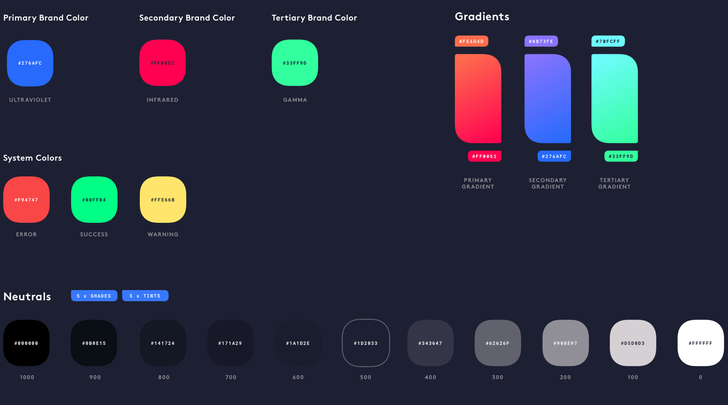
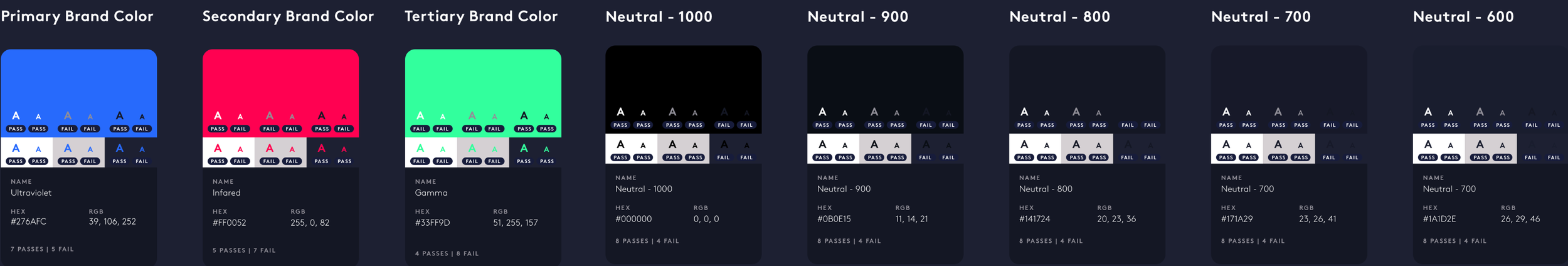
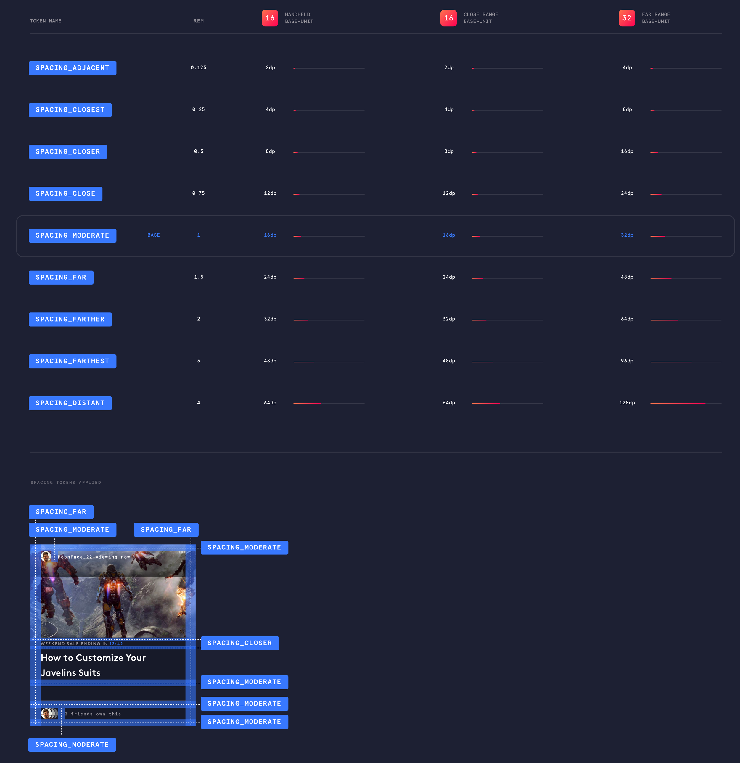
Defining the visual foundations of the system:
Color
Typography

01. Display Typeface - Major section titles and headings.


02. Primary Typeface - highly readable body copy.
03. Monospaced - Isolated data presentation and labelling.
Spacing
Strokes
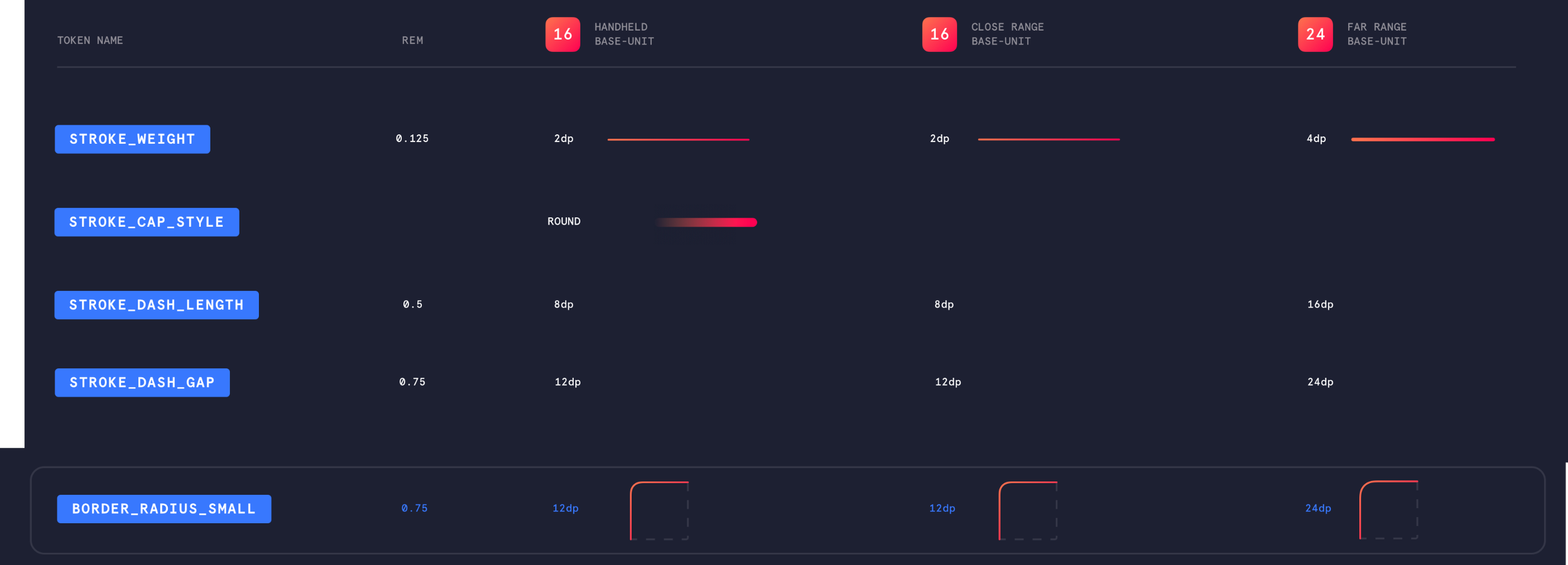
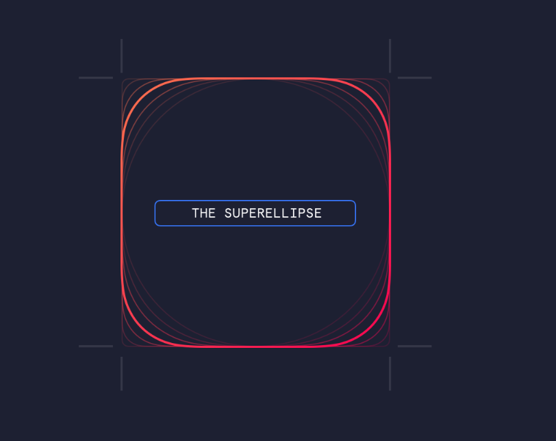
Shapes


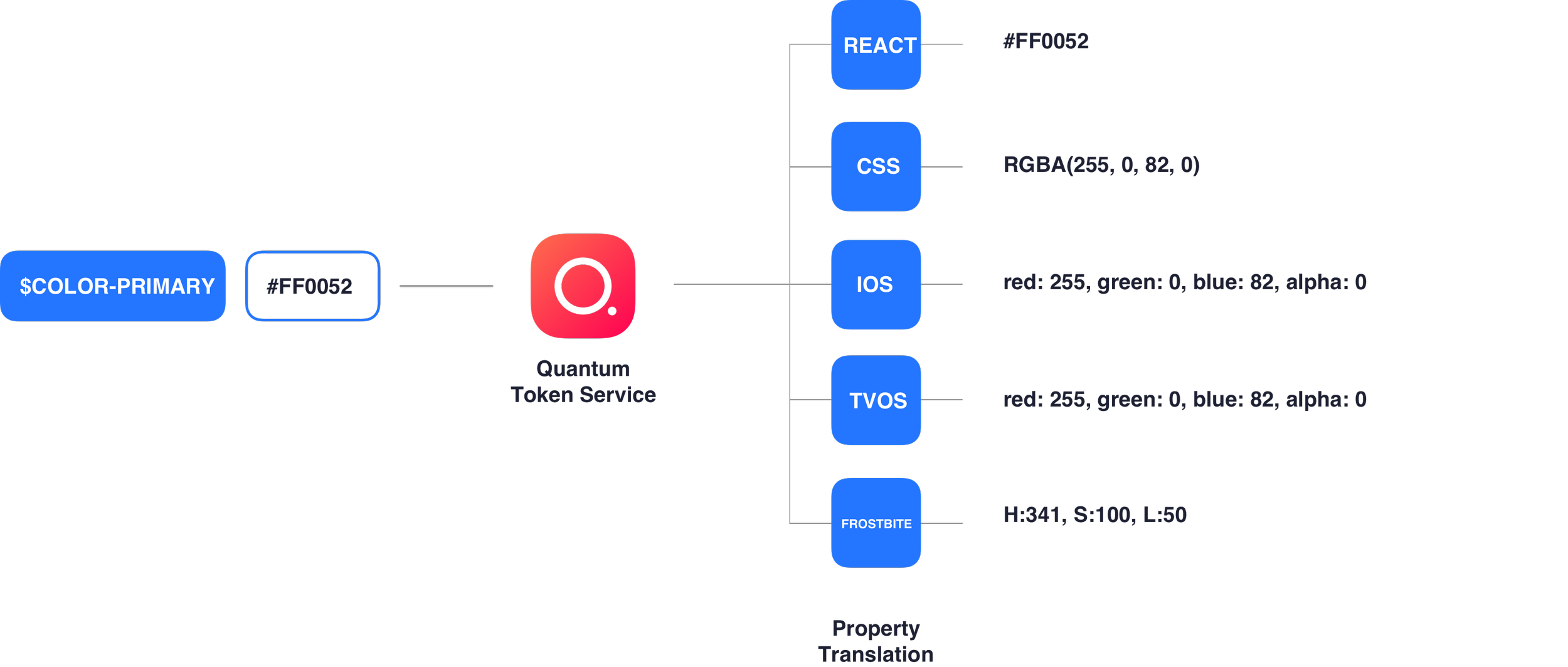
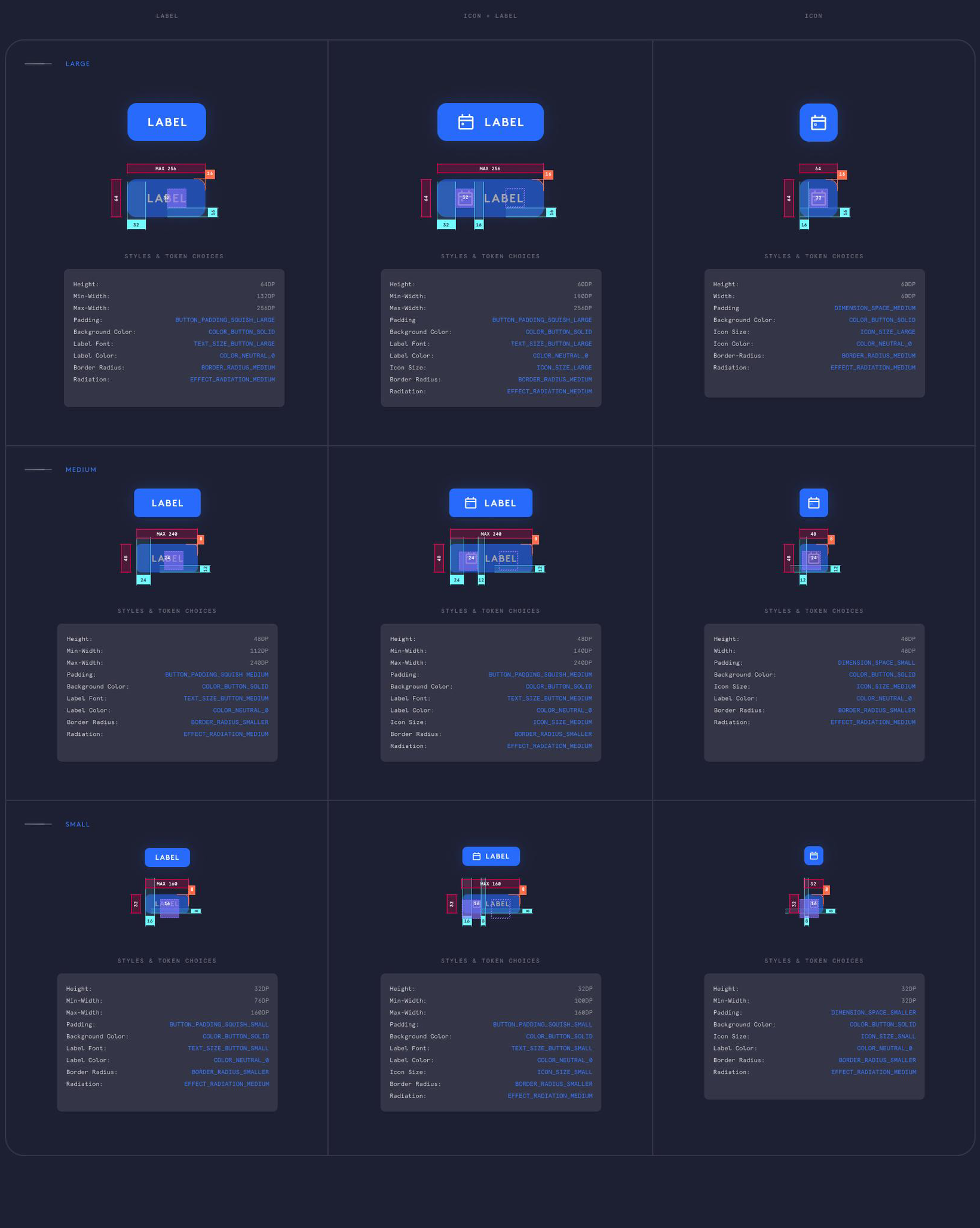
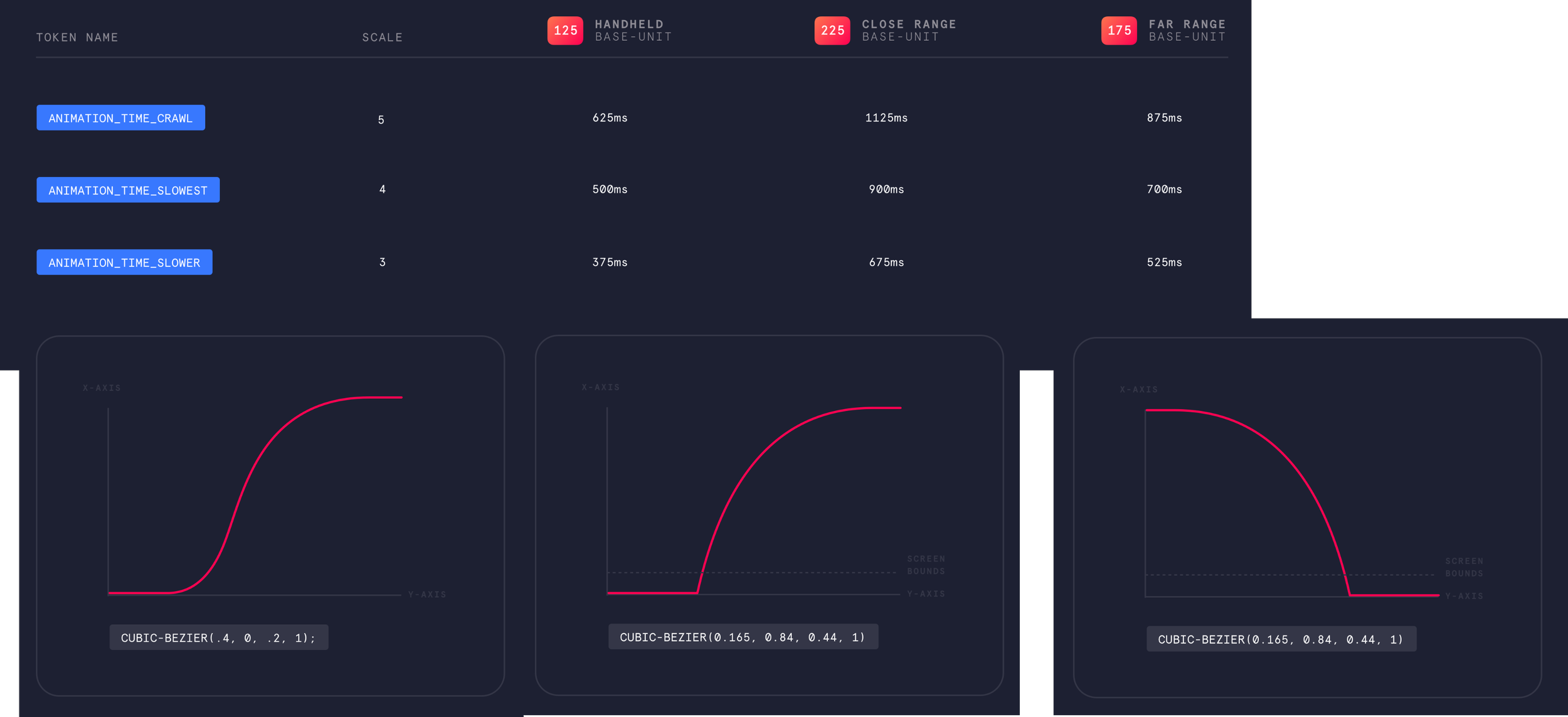
Codifying Design Decisions as Tokens
To ensure the system was applied consistently across the various platforms, we stored all design decisions as variables that could be transformed through a server-based system that then passes a language & platform-specific variant of that token straight into the code. This created consistency but also gave us central control to make tweaks in one place that propagated out.
Time to build some components!
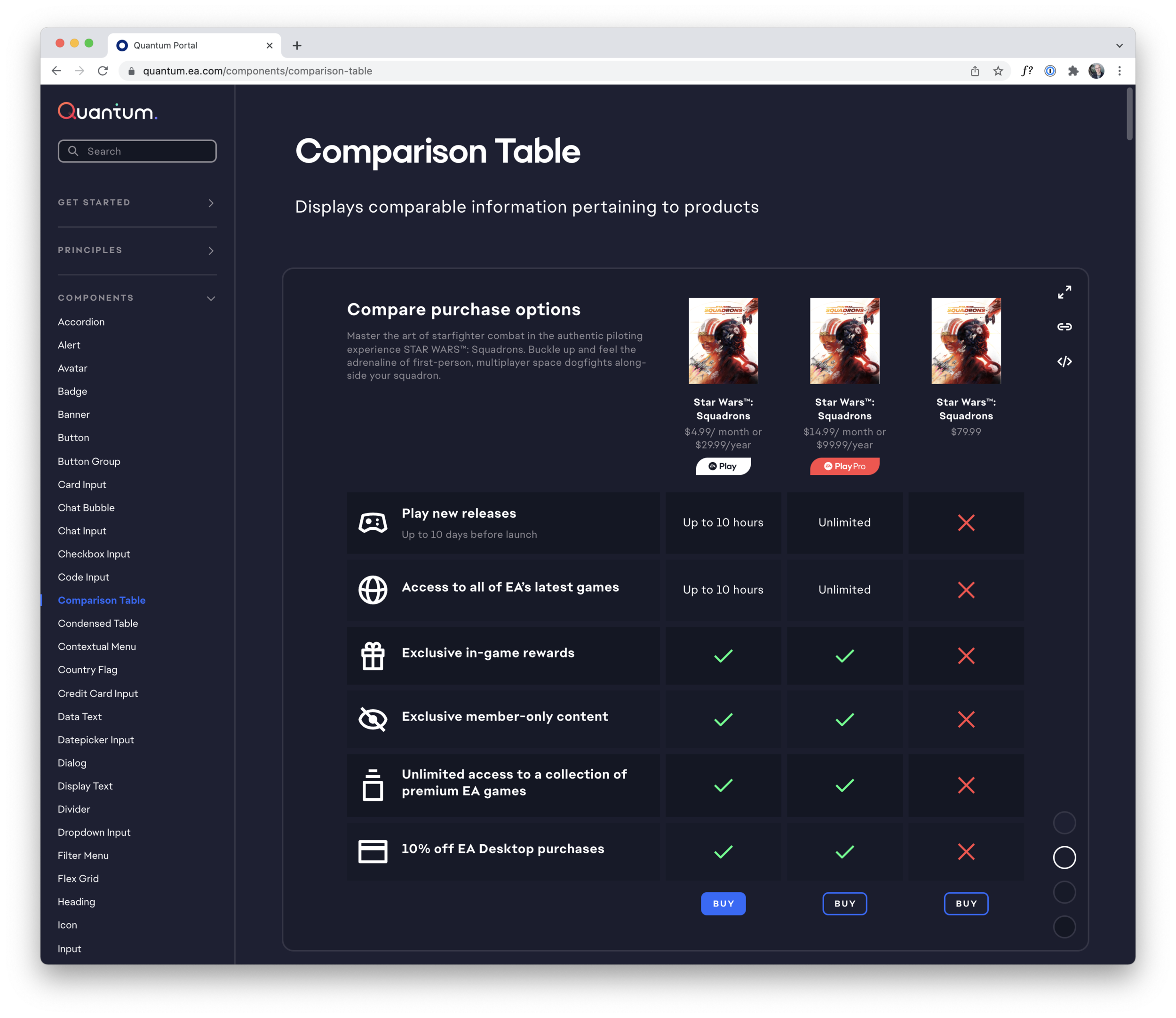
Applying systemized design decisions to UI
Tiles
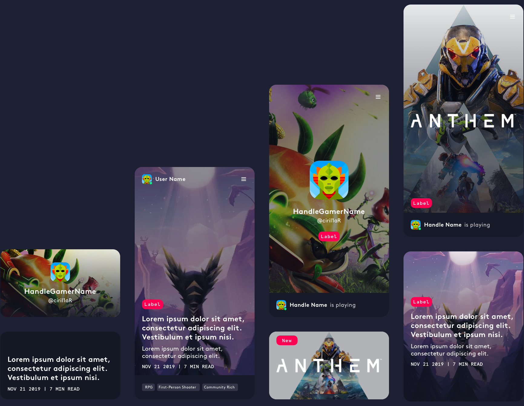
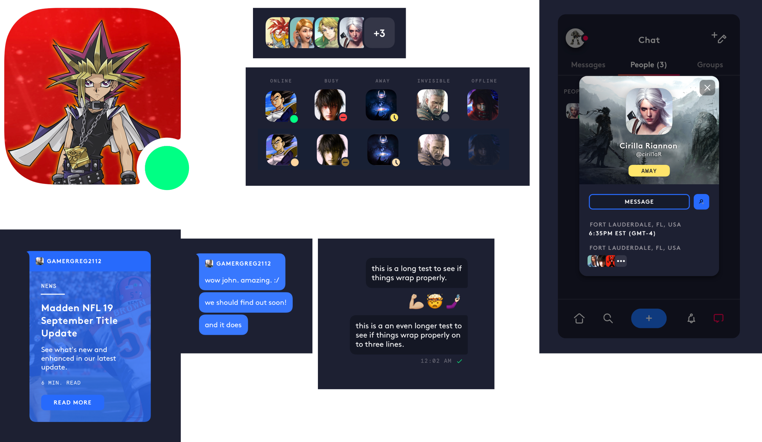
Social
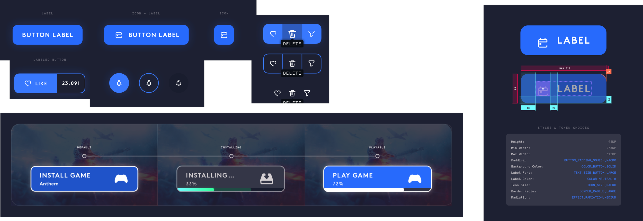
Buttons
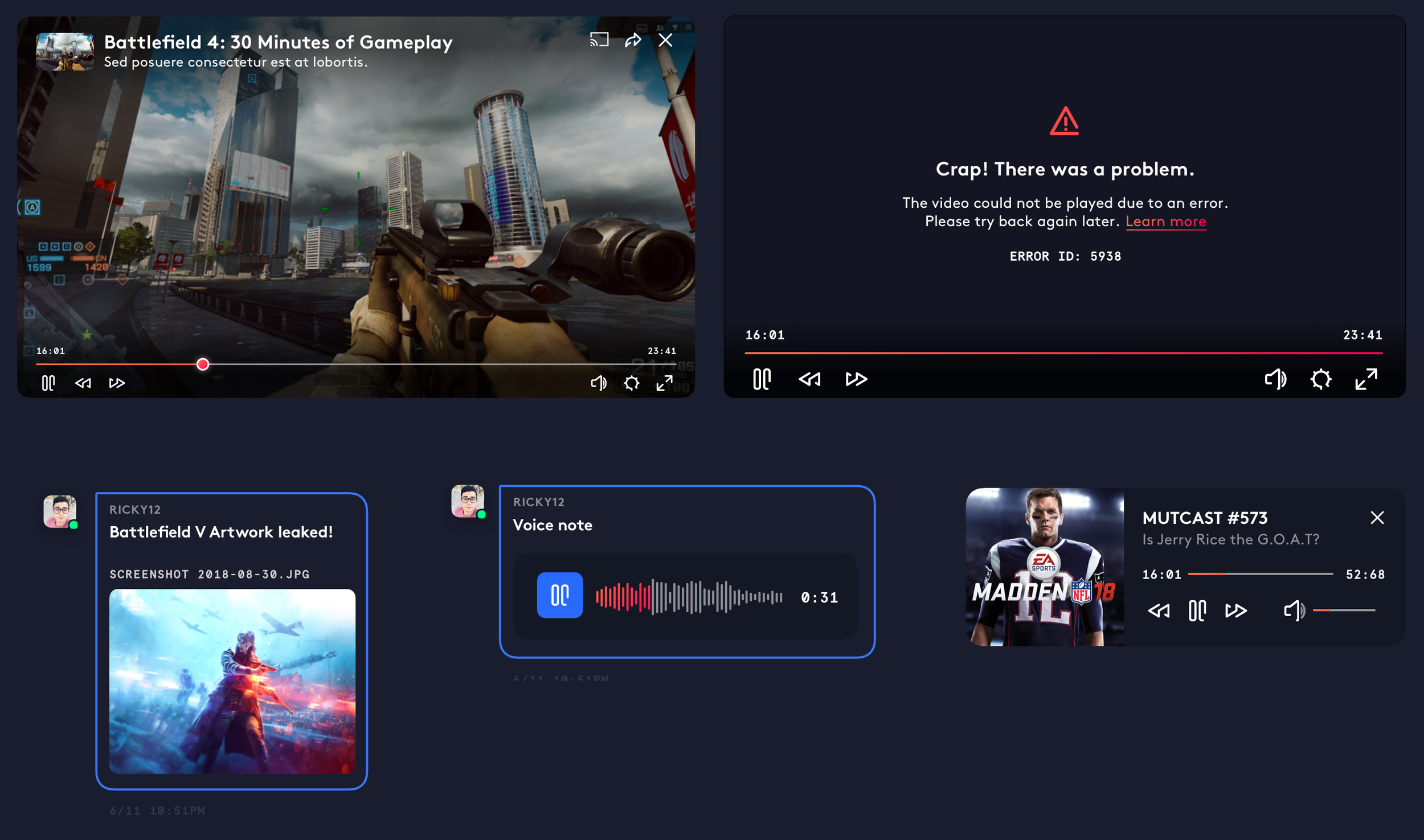
Media
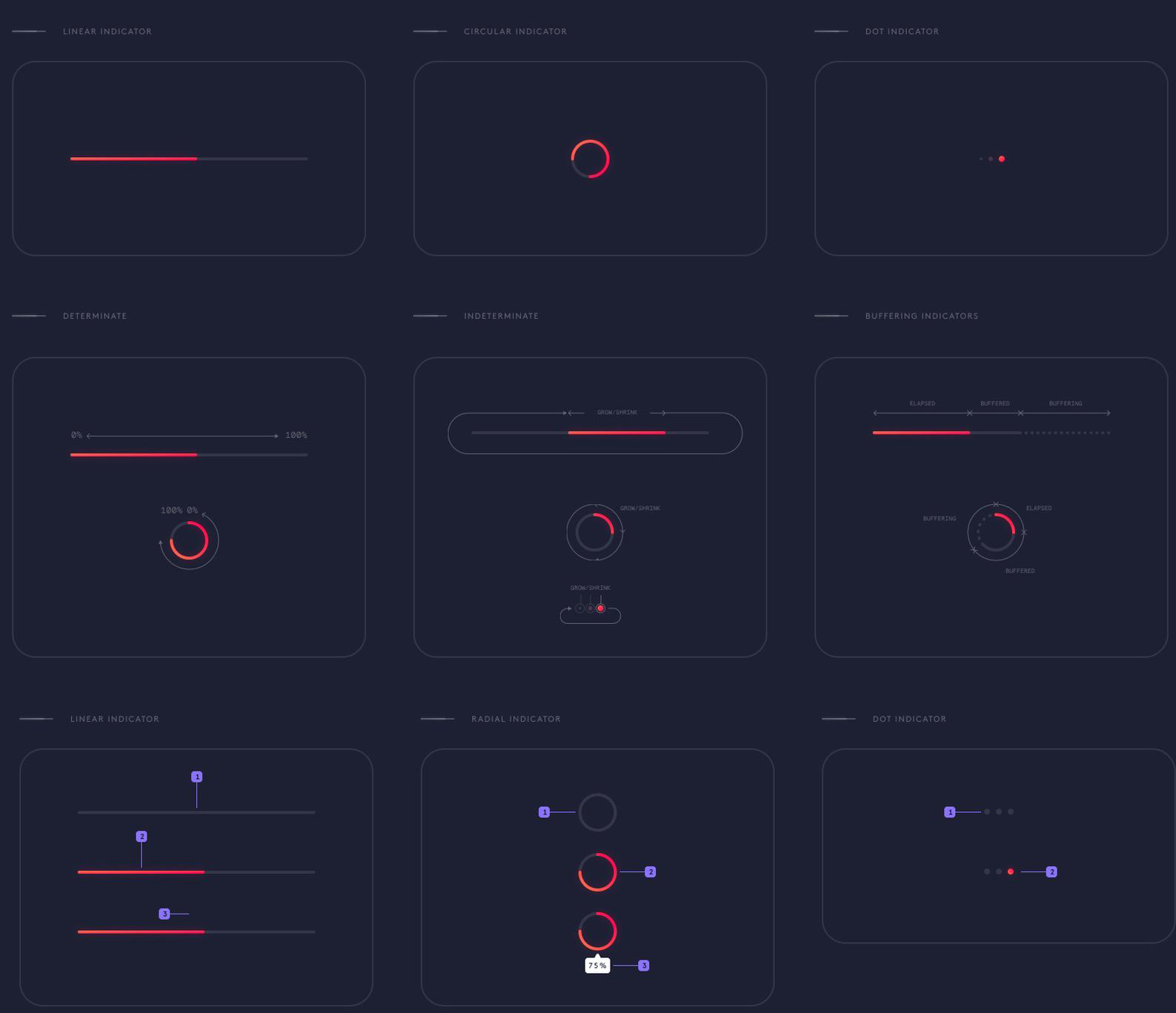
Animations & Loaders
All of which was thoroughly documented for multi-product use, of course.
The Results
Quantum was well received by senior leadership and successfully rolled out to have a positive impact on the development of the revised PC app and next-gen rebuilds of console/streaming subscription apps. The visual identity for Quantum also became the basis for all supporting brand design.
We then applied Quantum to EA Connect, a cross-play service implemented on all EA Sports titles across all supported platforms.

Case Studies
Epic Games
2020-2025
Creator Portal
Shop & Subscriptions
Electronic Arts
2014-2020
Quantum Design System
Cross-Platform Play
The Archives
2006-2014
Code School: Course Creation
LACMTA: Trip Planner