

Nook HD System and Apps
America’s favorite bookstore, in the palm of your hand.
My role: Sr UX Designer, leading design systems and look & feel of the core media apps
In the sunset of dissolution, everything is illuminated by the aura of nostalgia.
Throughout high school, I spent hours and hours in my local Barnes & Noble: looking at all the book covers, leafing through the magazines, discovering grown-up graphic novels. I felt safe there, and surrounded by things that gave me hope—that there was so much dark and silly and beautiful creativity in this world.
There are few other brands for which I have such an affinity. So when I had the opportunity to work at B&N, it felt like an opportunity to give back. I joined the team building out a complete overhaul of their Nook line of devices readying for a new launch, working on the design system and how it would be applied to the OS and core suite of applications.
Ultimately in retrospect I was contributing to the demise of this feeling, but hey: we made it look like paper, ok?
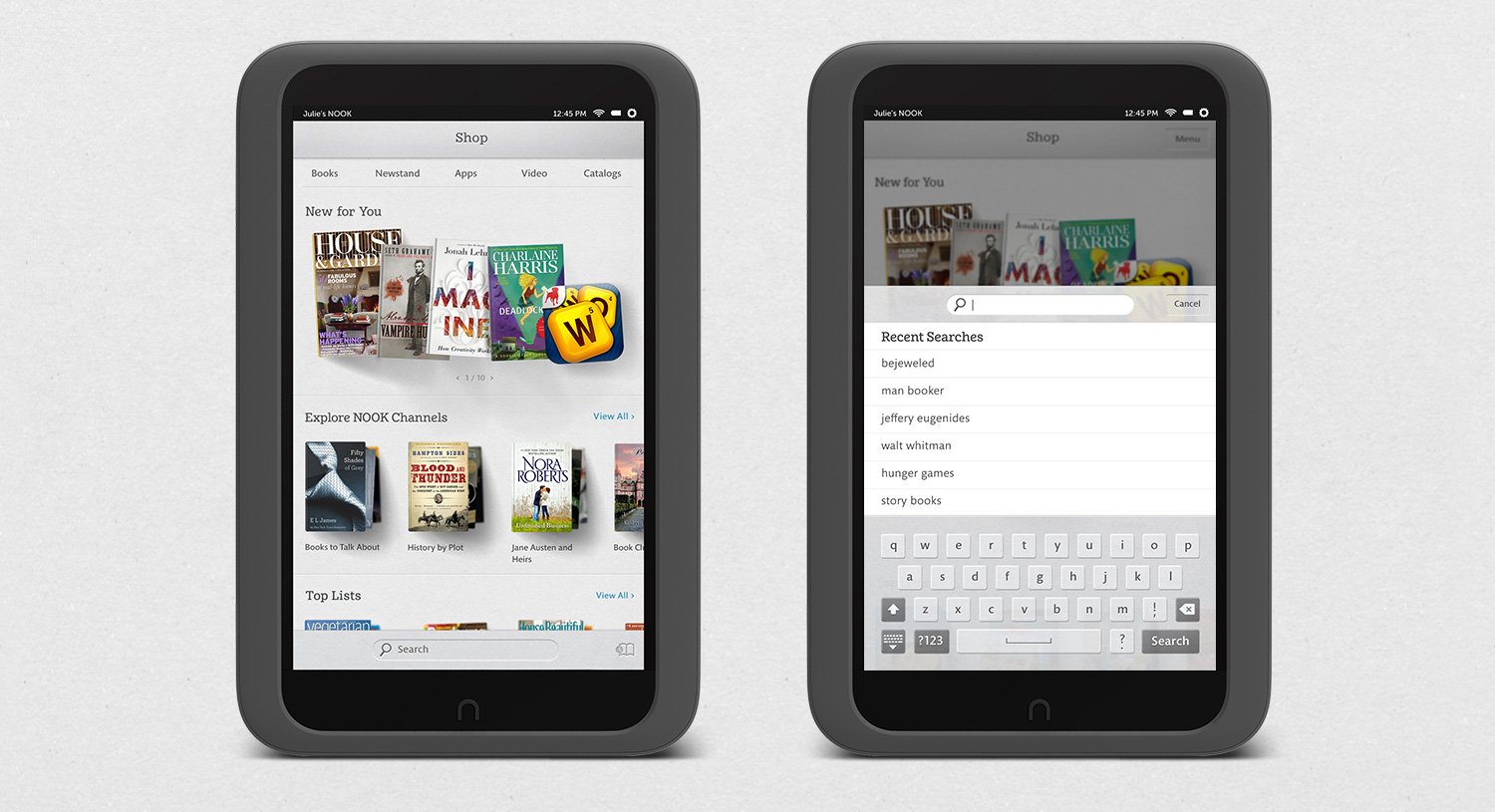
We wanted the feel of these devices to lean into the B&N brand pillar of ‘cozy’, moving away from the cold academia of the previous designs in devices and other media services on web.
Not at all cozy. Looks like a hospital or something.
One of many moodboards to inform design—cozy; etherial yet tactile.

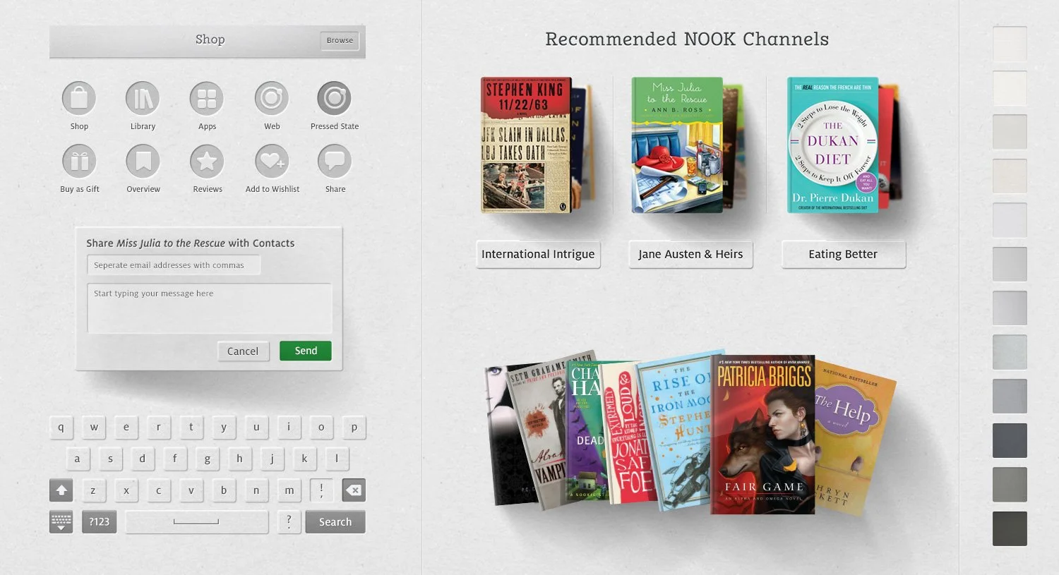
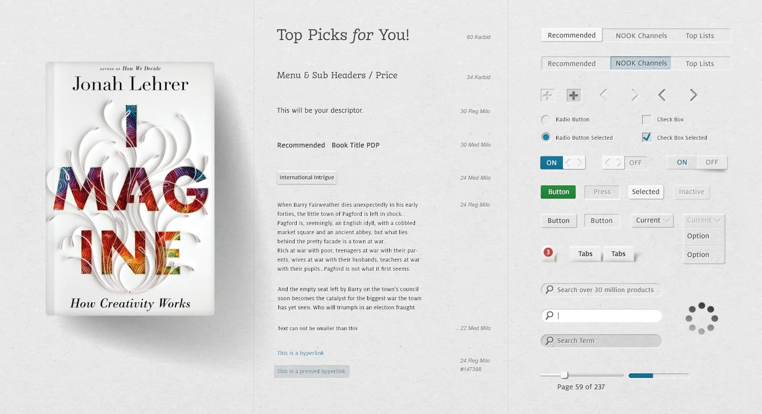
The UI needed to convey that textured coziness, reminding you that you were reading a book coming from a bookstore, not a lifeless digital facsimile. This was touch interaction, an early one at that, and it was important to bring to the experience something different than what was available elsewhere, something inviting. I brought in organic shadows, stacks and splays for grouped content reminiscent of coffee tables, and spines to books and gloss shimmers to magazines. Most UI cut into the ubiquitous texture other than the primary CTAs, adding more contemporary brightness.
Round 1. Too grey, leaning too hard into the analogy to be functional, but some good elements.
The final round. Clean, slightly tactile, and finding the line between analogy and function. Some things I don’t love now obviously, but it was 2012, ok?
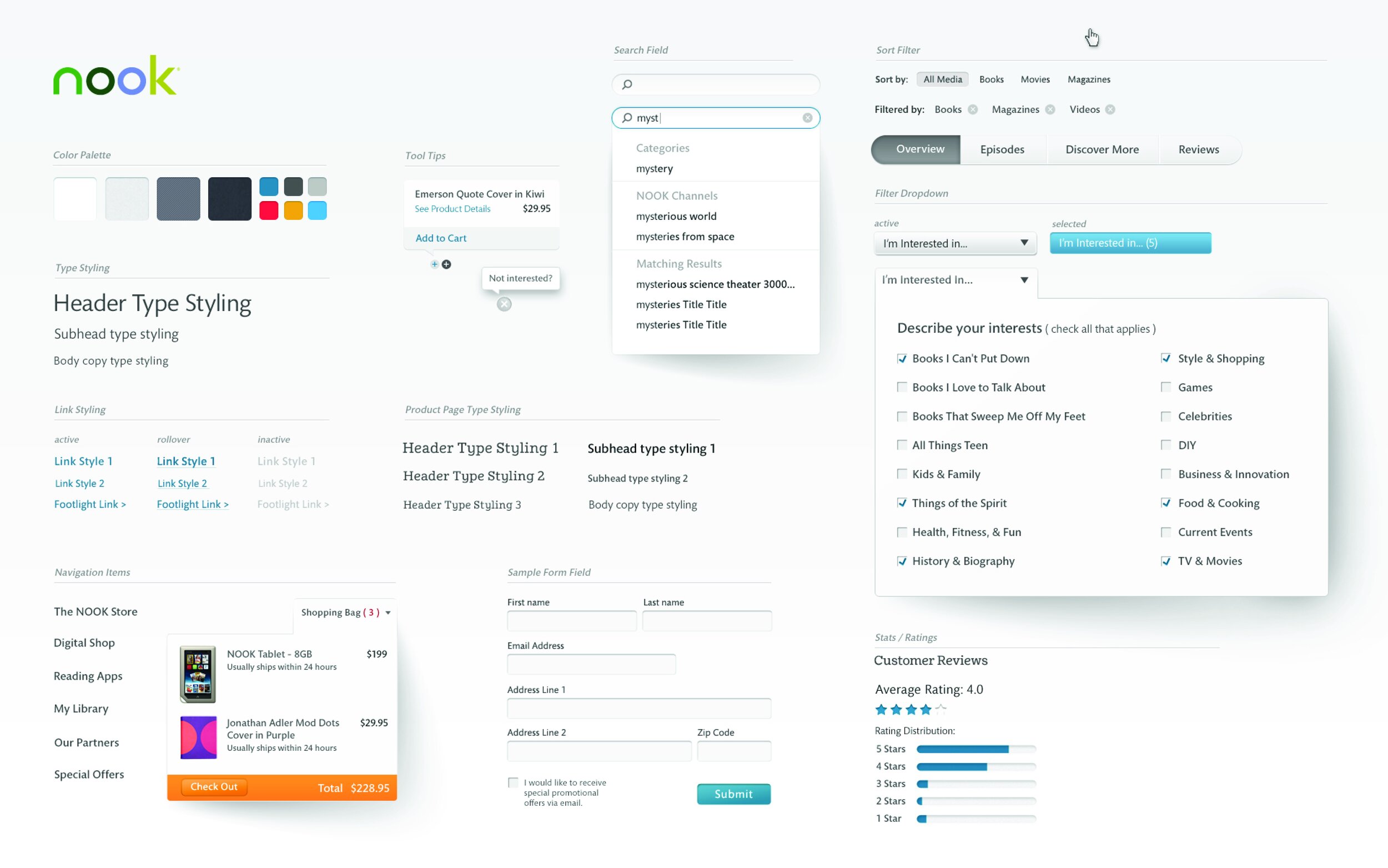


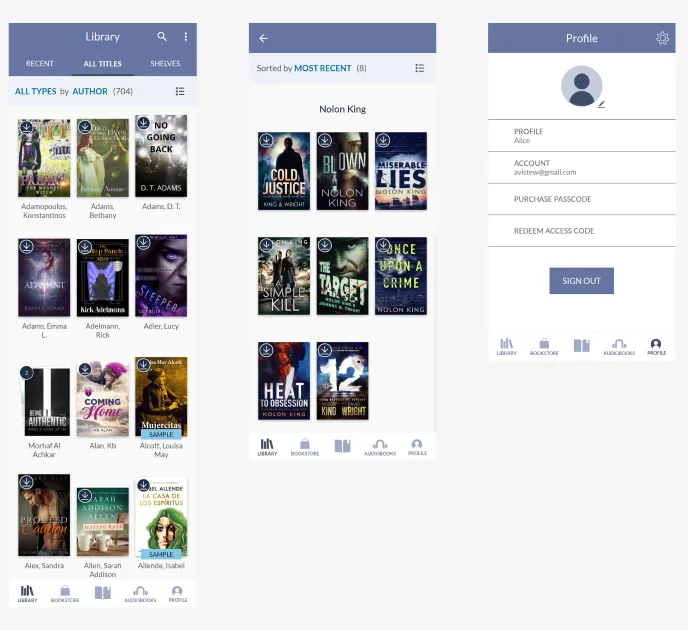
Everything applied to components and structured into a new homepage that I designed.
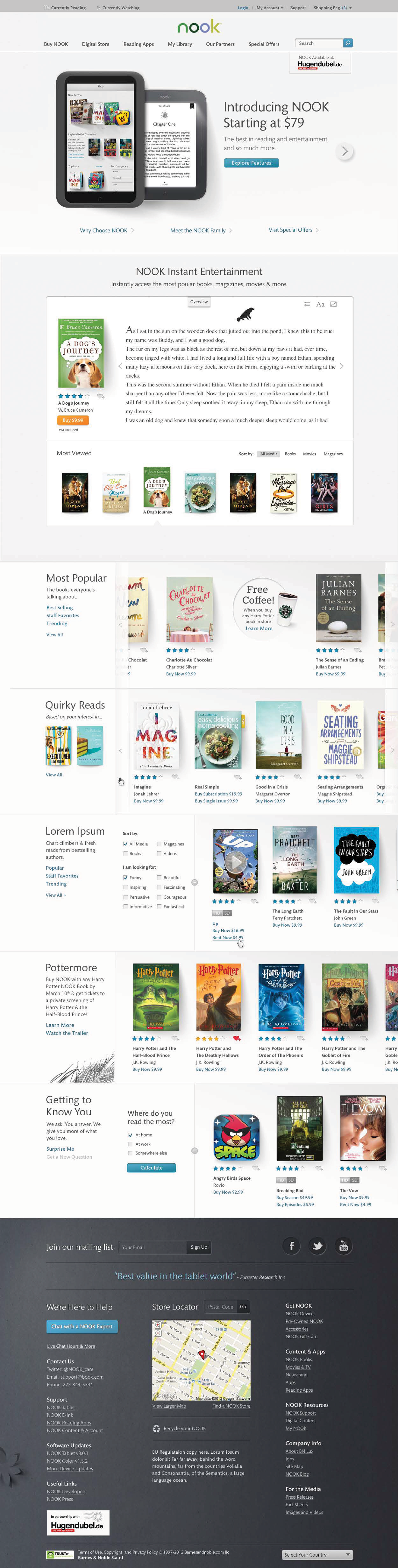
And I worked with the teams responsible for the core media applications. I designed the home and discovery experiences.

All great empires die from within. Thanks a lot, hindsight.
B&N struggled to shift its business strategy to focus on competing in the broadening landscape of digital content marketplaces. There were missed opportunities to connect the largest network of retail bookstores with their online products, and the pressure of Amazon, Apple, and Google moving into this space proved to be too much. Further, Nook as a brand did not resonate with B&N customers and felt disconnected from the retail experience.
This work is symbolic for me in both the evolution of contemporary UI design and my own growth. My experience in driving multi-product systems changed my perspective on what product design is and it’s value to a business—revealing the true nature of a brand and enabling it to scale. Despite a successful launch, Nook was not a success, but I’m very proud of this work and my forever connection with something I loved.
Case Studies
Epic Games
2020-2025
Creator Portal
Shop & Subscriptions
Electronic Arts
2014-2020
Cross-Platform Play
The Archives
2006-2014
Barnes & Noble: Nook HD
Code School: Course Creation
LACMTA: Trip Planner